Overview
App bars show information and actions related to the current page. They can be used for branding, navigation, and providing actions to the user
We have one type of bottom app bar and three types of top app bars: primary bars, back arrow bars, and full-screen modal bars
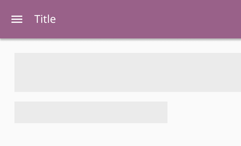
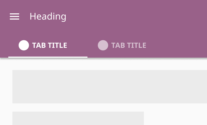
Primary bars
Primary bars are placed on top level pages. They may contain tabs that lead to top-level sections in this part of the application
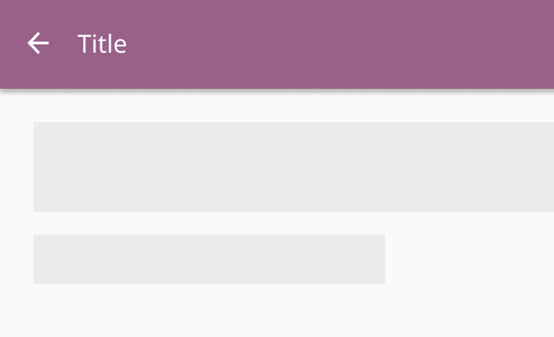
Back arrow bars
Back arrow buttons allow users to navigate back to the parent page in the hierarchy
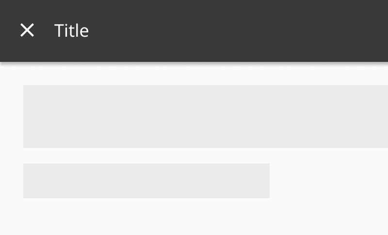
Full-screen modal bars
Full-screen modal bars allows users to dismiss a full-screen form from view
Bottom bars
Bottom bars contain contextual metadata and actions related to a page. Use bottom bars to accompany pages with full-screen forms or content selection. Bottom bars are usually sticky to the bottom of a page
Layout
Top bars
- Place navigation icons on the far left
- Place titles to the right of the navigation icon
- Place contextual icons to the far right
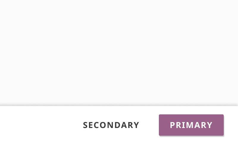
Bottom bars
- Place buttons on the far right
- Place any contextual metadata related to the task on the far left
- Place any contextual errors on the bottom of the metadata
- Place bottom bars at the bottom of the browser window
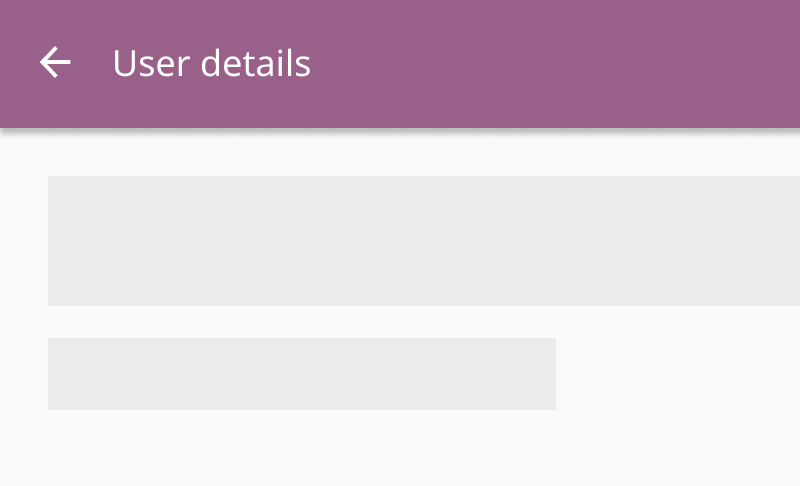
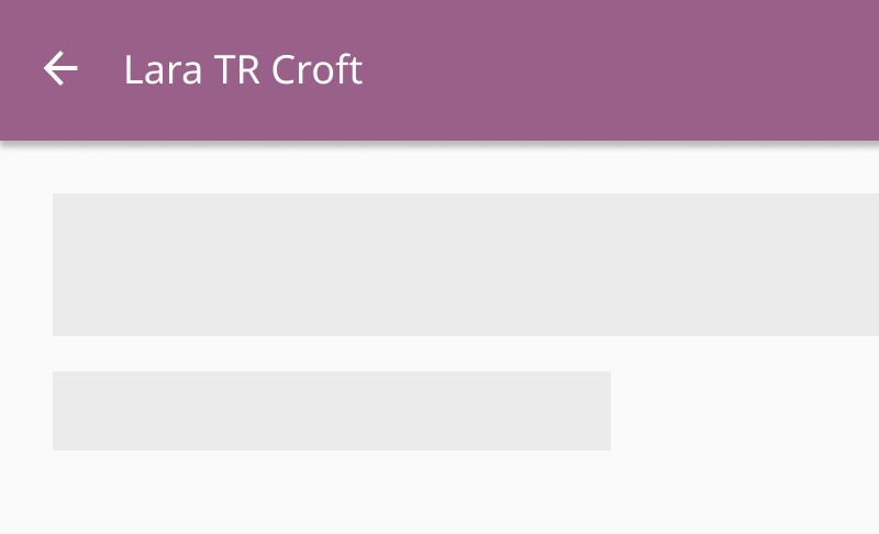
Titles
Top bars must have titles that describe the current page
- Titles can describe a feature a user is engaged in (e.g. Create Quiz)
- Titles can describe a high-level section of an app (e.g. Learn, Coach)
- Titles can describe an application being used (e.g. Kolibri Studio)
- Titles should never include names of user generated text (e.g. resource title or username)
Use general titles in top bars
Use user-generated text in top bars
Exceptions
Purposeful exceptions can be made to incorporate special elements into top bars
Change top app bar color to white if visual contrast is needed between the background and action buttons
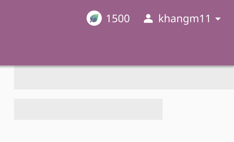
Place learning aids in top bars
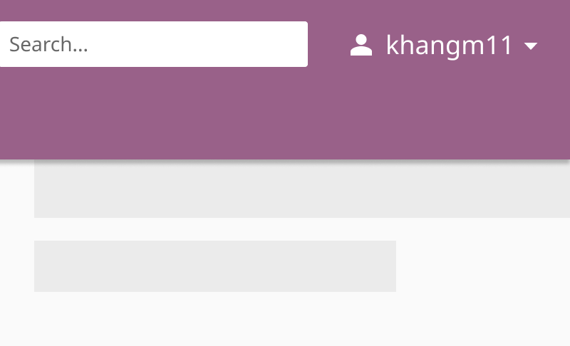
Place custom search fields in top bars
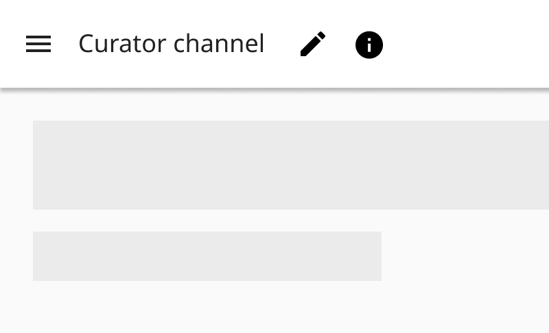
Icons
- Menu icon: opens up a navigation drawer
- Back arrow: takes the user back to the previous page
- Close icon: dismisses the edit form from view
Behaviors
Small screens and browser windows have an effect on different top bar components
Scrolling
- Scrolling upwards hides the top bar
- Scrolling downwards reveals the top bar
Responsiveness
- Top bar actions can be collapsed into an overflow menu
- Top bar tabs can become horizontally scrollable
- Search bars can shift to a new line and span the full screen width
Accessibility
- Icon and title placement become mirrored for right-to-left languages
- Top bar titles and iconography colors must meet 1.4.3 Contrast (Level AA) criteria