Overview
Errors occur when the software fails to do what the user expected it to or when the system fails. The system should display clear messages to help users identify when these errors happen and ways to quickly understand and resolve them.
Error types
User errors
User errors occur when a user input or interaction isn’t understood by the system. Examples include invalid field inputs and accessing blocked pages.
System errors
System errors are usually caused by factors that are not the fault of the user. Examples include connectivity or network issues, missing data or page not found, and other unexpected issues.
Language
Follow the writing guidelines with a special focus on clear, concise, and natural language. Explain causes of errors if it will help the user resolve their issue, but do not use complex technical terms and run-on explanations.
Error messages should also be actionable. Offer the solution as an action when possible and make sure the action label is specific to the outcome. If including an action isn’t possible, then briefly explain how the user can fix their problem.
“Sorry, something went wrong. Refresh page"
“500 internal server error. It looks like the server failed to fulfill an apparently valid GET or POST request. We are aware of this issue and you can try solving it by reloading the page. We apologize for the inconvenience and hope this doesn’t occur again.”
Tone
Let the user know what went wrong without blaming them. Do not use all caps, exclamation points, or other alarmist language.
“Please enter a valid email”
“WARNING!! You didn’t fill this out”
Even though errors can induce negative emotions, avoid being too whimsical and lighthearted. This can have the opposite effect and cause more frustration.
“Storage limit reached”
“Whoops! Looks like the tank is too full 😎"
Components and patterns
Color
tokens.errorpalette.red.v_600Icon
Sizes: 14px, 24px
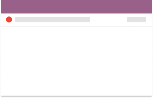
Banner
Banners are appended to the app bar and notify the user about global system errors and/or notifications that affect the whole app experience.
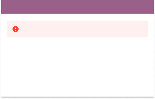
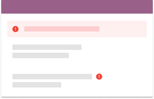
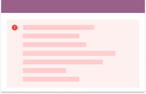
Error summary
Error summaries should appear at the top of the page and use an alert component. Use them in forms or for page-level errors that are not associated with a specific component or location on the page.
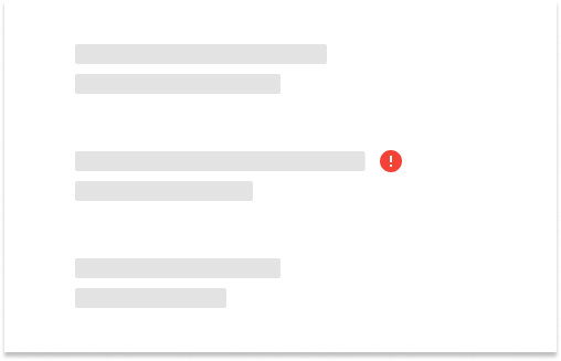
Inline error messages
Place inline error messages in close proximity to where the error occurred. This can be an
icon only, or icon and text. When paired with text, use KLabeledIcon
Page error
Sometimes pages do not load because of 404 or 500 errors, unsupported browsers, and restricted permissions. Users should see a brief explanation of what went wrong and an action that might help address the problem.

Preventing errors
One of the best ways to handle errors is to prevent them from happening in the first place. Following is a non-exhaustive list of common patterns that our products use to minimize the chance of users experiencing frustration from errors.
Disable, don't hide
If an operation can cause unintentional and irreversible data loss, or will create errors under the current condition, disable the action rather than hiding it. Disabling it provides the user with context as to what is possible. It should be clear to the user what they need to do for the action to become possible.
However, forms that create or update data generally should not have a disabled submit button and follow our form validation patterns instead.
Warnings
For operations that imply risky permanent data loss, use modals for the user to confirm they really intend to remove that data. Be sure to clearly explain the consequences.
For conditions which partially block or interrupt the user experience, use a warning icon
with palette.orange.v_200 and informative language of the consequences under
the current condition.

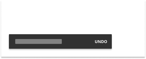
Undo
Modals are helpful for preventing errors but should not be overused since they can disrupt user flow. For operations with relatively significant but not critical consequences, provide the option to undo an action.
Good defaults
Especially for repetitive, common actions, setting configurations to known commonly used defaults can help people save time and avoid overlooking unintentional errors.
Progressive disclosure
Error messages are important, but should not overwhelm the user. Apply the concept of progressive disclosure to prevent surprises and frustration.
For error messages, this means not showing all error messages at once. Show enough information for the user to discover where the problem is, and present the detail they need at the moment of resolving the error.
Accessibility
Do not use red color as the only indicator for errors. Color alone is not sufficient to indicate an error state. Errors must be accompanied by an additional visual indicator such as an icon as mentioned in inline error messages .
Important information to resolve errors should also be keyboard accessible. Avoid using snackbars and tooltips as the primary way to access this critical information.