Overview
The goal of good layout is legibility - to aid the user in quickly identifying what they need on the page. This is achieved through effective use of white space, graphics, typography, and visual separators.
Spacing
To aid with alignment, all UI elements should be spaced out in increments of
8px. On smaller screens or in more compact spaces, the increment can be reduced
to 4px. All margin and padding measurements should be incremented by these
units.
Similarly, define
keylines
in increments of 4px or 8px when UI elements must be placed
outside of the alignment to columns and rows within a grid.
Page containers
A page container is a shape used to represent an enclosed area. Page containers can hold various UI elements such as an image, icon, or surface. They can be flexible and accommodate the width or height of the content within, or they can be rigid and fixed in size.
Page containers can be implemented using
KPageContainer
which includes responsive internal padding that automatically gets smaller on smaller
windows. Containers and their contents can be arranged using
KGrid
or
KFixedGrid
, described below.
To reduce visual noise, avoid nesting containers in containers.
Maximum width
If a page container contains text, set its maximum width to 1000px in order to
aid readability on larger screens. Extra space should be allocated equally on both sides
such that the page container is centered.
Dividers
Use dividers to create visual distinction between sections within a page container. A
divider should span the entire width of a container and be 1px high with color
tokens.fineline
.
Use sparingly and reserve them for situations where white space does not properly separate elements or groups of elements, such as a table, compact list items, or list sections.
Dividers may also have internal page container tabs associated with them, such as in Kolibri Coach reports and planning pages. These may be added to the design system in the future.
Responsiveness
There are three primary breakpoints in the design system that should suffice to design and build responsive layouts in the majority of cases. These are:
- Small:
width < 600px - Medium:
600px < width < 840px - Large:
840px < width
If more granularity is necessary there are additional breakpoints defined:
- Level 0:
< 480px - Level 1:
< 600px - Level 2:
< 840px - Level 3:
< 960px - Level 4:
< 1280px - Level 5:
< 1440px - Level 6:
< 1600px - Level 7:
>= 1600px
Responsive layouts in the design system are built using reactive JavaScript state in Vue
components rather than CSS media queries. This is done using
useKResponsiveWindow when reactive window's size information
is needed or useKResponsiveElement when reactive component's
size information is needed.
Grid system
Grids allow UI components to adapt to screen sizes and orientations and ensure consistent, visually-appealing layouts both within a particular page and across different pages. Our grid system gives designers and engineers a shared vocabulary for communicating about page page layouts and how they adapt to variations in content and screen sizes.
The design conventions and Vue components provided by the design system work well together, but both can also be used on their own: Designs specified using the grid system do not need to be implemented using grid components, and grid components can be used even when not explicitly specified in the designs.
That said, when designers use grid system conventions and engineers use grid system components we can more easily:
- Align elements on the page to aid readability and improve aesthetics
- Design and build responsive behaviors which are robust to changes in content and screen size
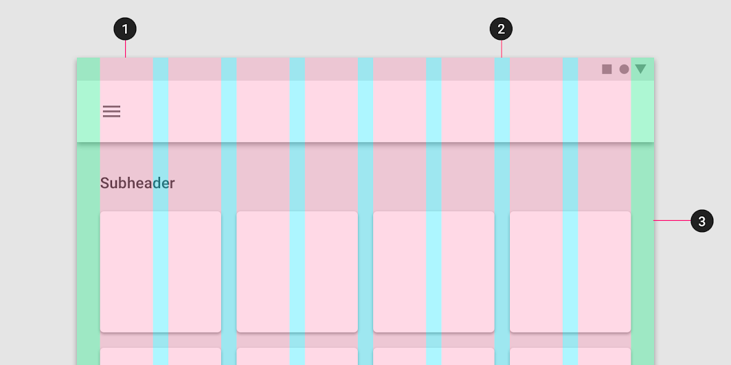
Like many aspects of our design system, the grid system draws heavily from Material's Responsive layout grid. Some of the illustrations below are also copied from the Material site.
Key concepts
Four key concepts form the basis of our grid system. Explicitly using these concepts in designs will help translate layouts to implementation:
- Columns define boundaries for horizontal alignment
- Gutters provide padding between columns
- Margins provide padding outside of columns
- Grid items hold content in blocks that span some number of columns
Columns, gutters, and margins are defined the same as in Material Design:
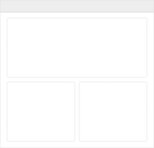
The example below shows a small window with four columns. The page container on the left is one column wide and the page containers on the right are three columns wide:
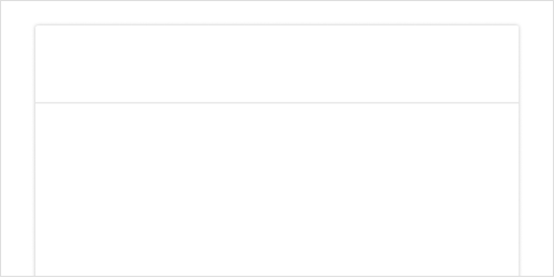
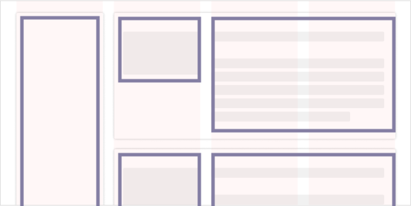
Grid items are a concept specific to Kolibri's grid system, based loosely on the same concept from CSS grids. Grid items represent a group of content that should expand and contract together as sizes and contents change. Below, there is a single-column grid item on the far left. Inside each page container on the right, there is a single-column grid item on the left and a two-column grid item on the right:
For browser compatibility reasons our grid system is based on inline-block and
not CSS grids, so the behavior is slightly different and vertical alignment can be somewhat
trickier, sometimes requiring nesting grids.
Breakpoints
The total number of columns on the page constrains the maximum width of the grid items. To ensure reasonable behaviors at all screen sizes, our grid system defines different layouts for different screen sizes corresponding to the responsiveness breakpoints defined above . Each breakpoint range has default number of columns, gutter width, margin, and padding. These defaults can be changed if necessary.
- Small windows have four columns with
16pxgutters - Medium windows have eight columns with
16pxgutters - Large windows have twelve columns with
24pxgutters
Note that we also use Vuetify in Studio, and those breakpoints are slightly different.
Responsive grids
The
KGrid
and
KGridItem
components implement grid containers and items with responsiveness built in.
KGrid automatically changes the total number of columns based on window size,
and KGridItem allows specifying column spans and text alignment for each of the
three window size ranges.
For example, a common pattern in Kolibri is to have a button right-aligned at the top of a page alongside the header on large windows, but on medium and small windows to move the button underneath the header and left-align it. To do this with the responsive grid:
      <KGrid>
        <KGridItem :layout12="{ span: 9 }">
          <h2>Lorem ipsum dolor sit amet, consectetur adipiscing elit</h2>
        </KGridItem>
        <KGridItem :layout12="{ span: 3, alignment: 'right' }">
          <KButton
            text="Button"
            primary
          />
        </KGridItem>
      </KGrid>
Each grid item is described by layout objects which can contain a column
span and default text alignment. When no additional layout
information is provided, the span defaults to the total number of columns (i.e.
full-width), and alignment defaults to 'right'.
In the code above, we leave the defaults for layout4 and
layout8 breakpoints. For large-screen, twelve-column layouts however we specify
that the header grid item should span 9 columns and the button grid item should span 3 and
be right-aligned.
Try resizing the browser to see the behavior:
Lorem ipsum dolor sit amet, consectetur adipiscing elit
Note that an additional complexity not shown in the example above is that conditional
styling sometimes needs to be applied using useKResponsiveWindow properties.
See the source code of this page for details.
Also note that grid containers have a debug property that will show helpful
visual information about columns and grid items when set to true.
Fixed grids
There are some situations where it is not desirable to have the number of columns vary
dynamically with screen size. In these situations you can use the The
KFixedGrid
and
KFixedGridItem
components. KFixedGrid has a numCols property to set the number of
columns, and KFixedGridItem takes simple span and
alignment properties rather than the layout objects.
Nested grids
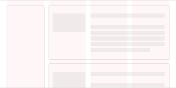
A page can contain nested grids. A container component can exist on a grid and also have its own grid that its contained components can lie on. This can be valuable for handling complex layouts.
The example shown above would probably need to be implemented using nested grids:
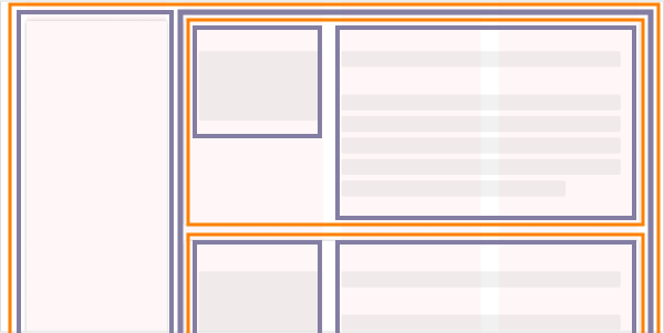
Here it might make sense to make the outer grid responsive, and implement the inner page containers or cards with fixed grids.