Overview
Simple modals break the user’s attention away from the main UI in order to focus attention on a singular action or task. They can contain alerts about important information and allow the user to edit data.
You can use the KModal component to implement modals.
Layout
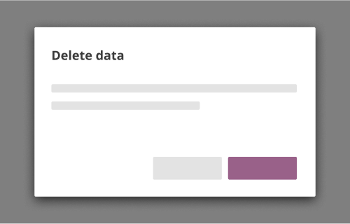
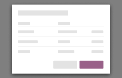
Modals have 3 sections that are always present: title, content, and actions.
Optional:
- Text prop below title
- Secondary button


Title
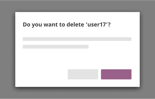
Keep this short, concise, and easy for the user to understand. Titles should not be structured as a sentence or question, and should not contain user-generated text. Use verbs in the imperative form. Do not use verbs that end in "-ing"; doing so may give users the impression that a task is in progress when it is not.
Content
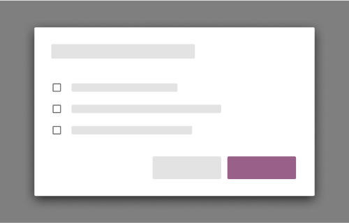
Along with text, the following UI elements are allowed in the content section of a modal:
- Text field
- Checkboxes
- Radio
- Select dropdown
- List with vertical scrollbar
- Loaders
- Link buttons and icon buttons
Scrolling
If a modal happens to have a content section that expands beyond the max height, enable vertical scrolling.
There should never be horizontal scrolling inside a modal.
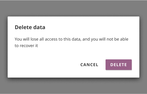
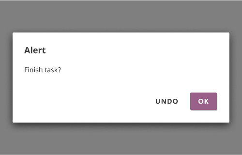
Actions
There is always a raised action button present at the bottom right. Should always be affirmative (i.e. will save data or continue user to the next step).
If there is a need for a secondary action, use a flat secondary button that is placed to the left of the action button. Secondary actions should always be dismissive (i.e. does not save any altered data, or cancels a next step).
The button group should be right-aligned.
Style
Size
Generally, modals should be of three sizes to accommodate varied screen sizes:
- Small: 300px width. Default size of modals
- Medium: 450px width. Use for text-heavy modals
- Large: 100% width. Use on an exceptional, case-by-case basis
If there are other cases when a simple modal should be increased in width, follow Material’s guide: increment by 56px.
Scrim
The scrim is the semi-translucent backdrop which covers the rest of the page. It should be
rgba(0,0,0,0.7).
Behaviors
URL behavior
Simple modals should not have a URL.
Dismissing modals
Modals with a primary button can be dismissed in a few ways: through a “cancel/close” button within the modal, or pressing the escape key. For these modals, the enter key should trigger the primary action.
Modals that are purely informational and contain only a single dismissive button can also be dismissed with the escape key or the enter key.
Modals are never dismissible by clicking the scrim.
Errors
If the user experiences a client-side or server-side error, the corresponding validation messages should display within the modal.
Accessibility
Modals should be keyboard accessible for users who use assistive technology. Tabbing should limit the user to the options within a modal only and not extend to the UI beneath it.
Examples
Present one modal at a time
Overlay modals on modals
Use modals for simple, singular, focused tasks
Insert a table or other complex interactions
Use language which directly implies the result of the action
Use ambiguous language for titles, content, and actions
Present a single way to continue through and exit the modal
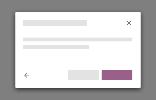
Use an ‘X’ button, back, or other duplicative actions